
The final banners reflect Airdry’s identity: minimal, clean, and science-backed, helping customers instantly understand why Airdry is the smarter choice for their home.
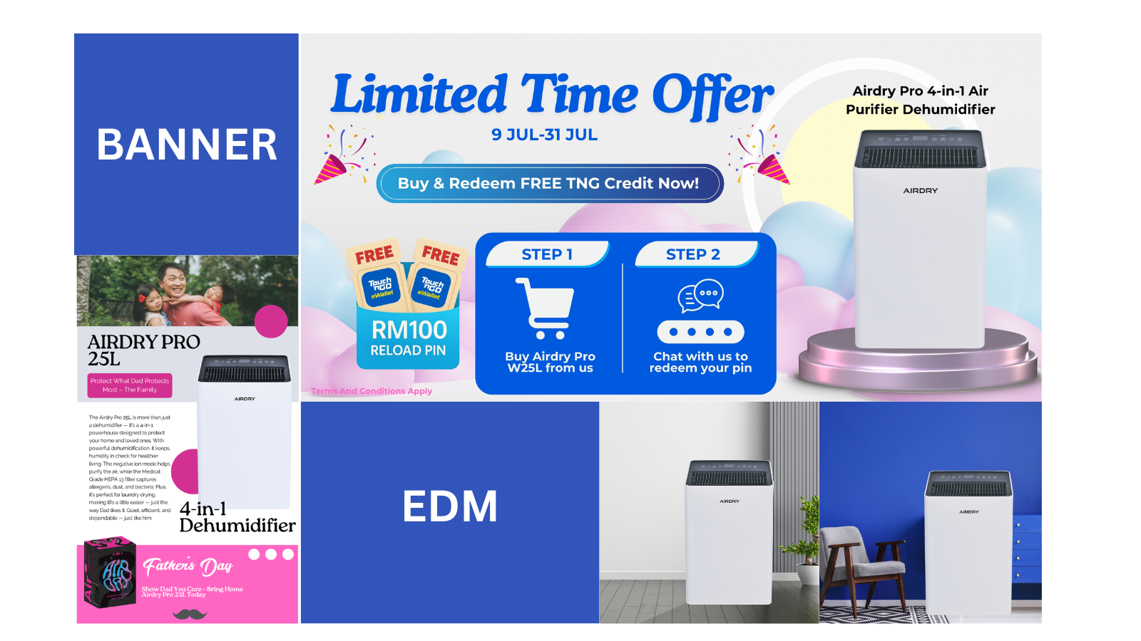
How We Designed Fresh & Customer-Centric Banners
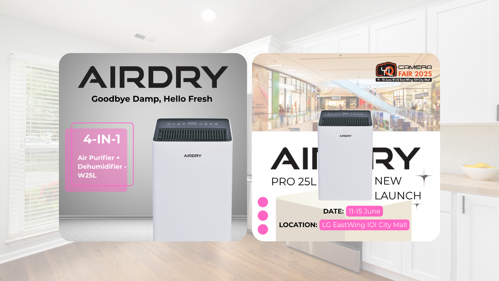
• A Clean & Modern Visual Aesthetic
We used bright, airy backgrounds, soft shadows, and clean lines to create visuals that feel fresh—matching Airdry’s purpose of improving air quality and comfort. The design style reinforces a sense of cleanliness and purity.
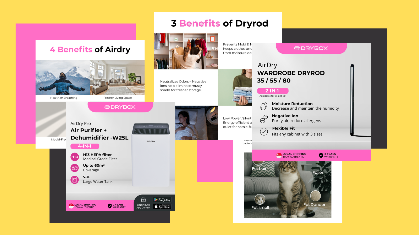
• Highlighting Key Features at a Glance
Each banner focuses on Airdry’s most important benefits:
- HEPA H13 filtration
- Ionizer function
- Energy-efficient dehumidification
- Whisper-quiet operation
- Child-safe & pet-safe design
Icons and simple text callouts make these features easy to digest within seconds.
• Strong Problem–Solution Messaging
We crafted headlines that speak directly to customer pain points:
- Mold growth
- Damp smell
- High humidity
- Dust & allergens
Each banner clearly shows how Airdry solves these everyday home issues.
• Optimized for Multi-Platform Use
Banners were designed for:
- Website hero sections
- Shopee & Lazada store displays
- Google Display Ads
- Social media placements
- Seasonal sale campaigns
Layouts remain consistent and high-quality across all screen sizes.
• Soft Yet Effective Call-to-Actions
We used CTA buttons and placements that encourage action without being overly aggressive. Examples include:
“Breathe Fresher Today”, “Shop Airdry”, “Improve Indoor Air Quality”.
• Consistent Branding Across All Visuals
We followed Airdry’s brand direction tightly:
- Fresh white/soft blue palette
- Minimalistic typography
- Clean spacing
- Calm, wellness-focused design style
These elements create a cohesive identity that customers easily recognize.
Project Outcomes
Clearer Product Understanding
Customers immediately understand Airdry’s 4-in-1 functionality through structured visuals and clear icons.
Higher Conversion Rates
Simplified messaging + improved visual clarity = more add-to-carts and fewer confused shoppers.
Improved Customer Trust
Science-backed banners help reinforce Airdry as a home-healthy, safety-focused brand.
Stronger Platform Presence
Consistent, polished visuals across Shopee, Lazada, and the website improve overall brand perception.
Increased Engagement
Clean, modern visuals with relatable messaging encourage customers to explore more products.
Conclusion
By focusing on clarity, freshness, and customer education, we delivered banners that strengthen Airdry’s digital identity and help customers make informed decisions. These visuals go beyond aesthetics—they communicate value, build trust, and support long-term brand growth.
